
Playful Colors Brand Identity Design
Evin's Color Fun Gallery
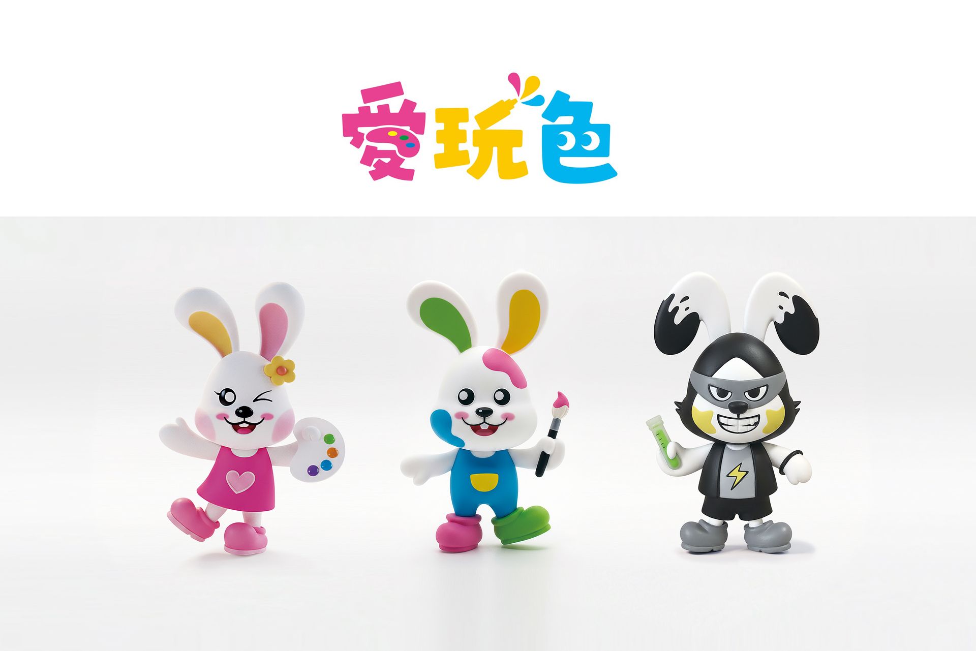
Playful Colors Brand Identity Design
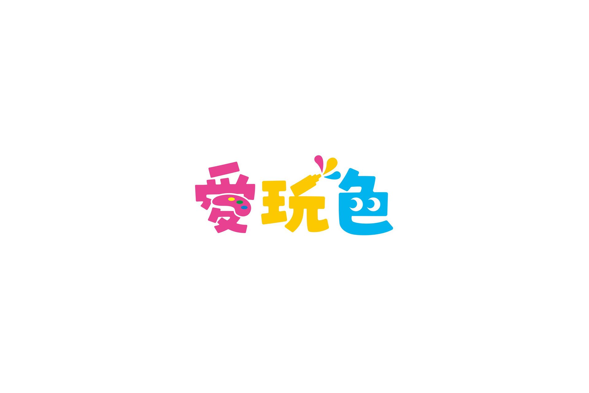
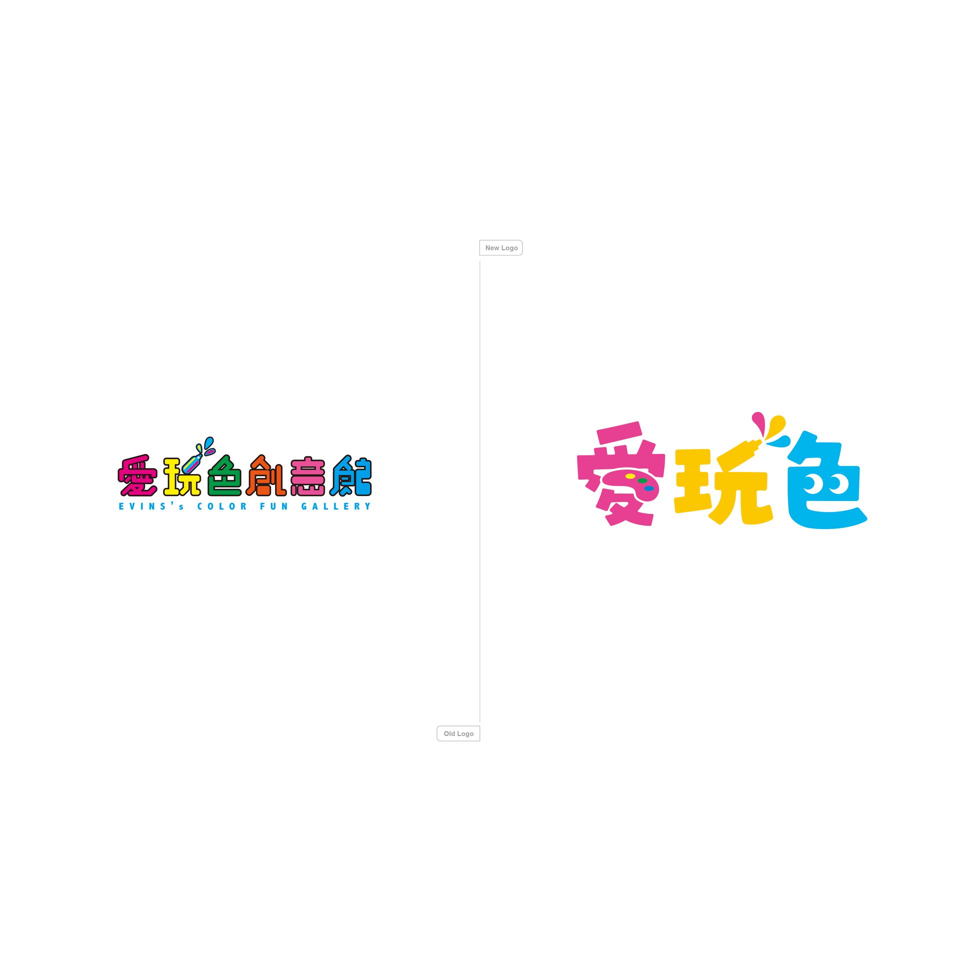
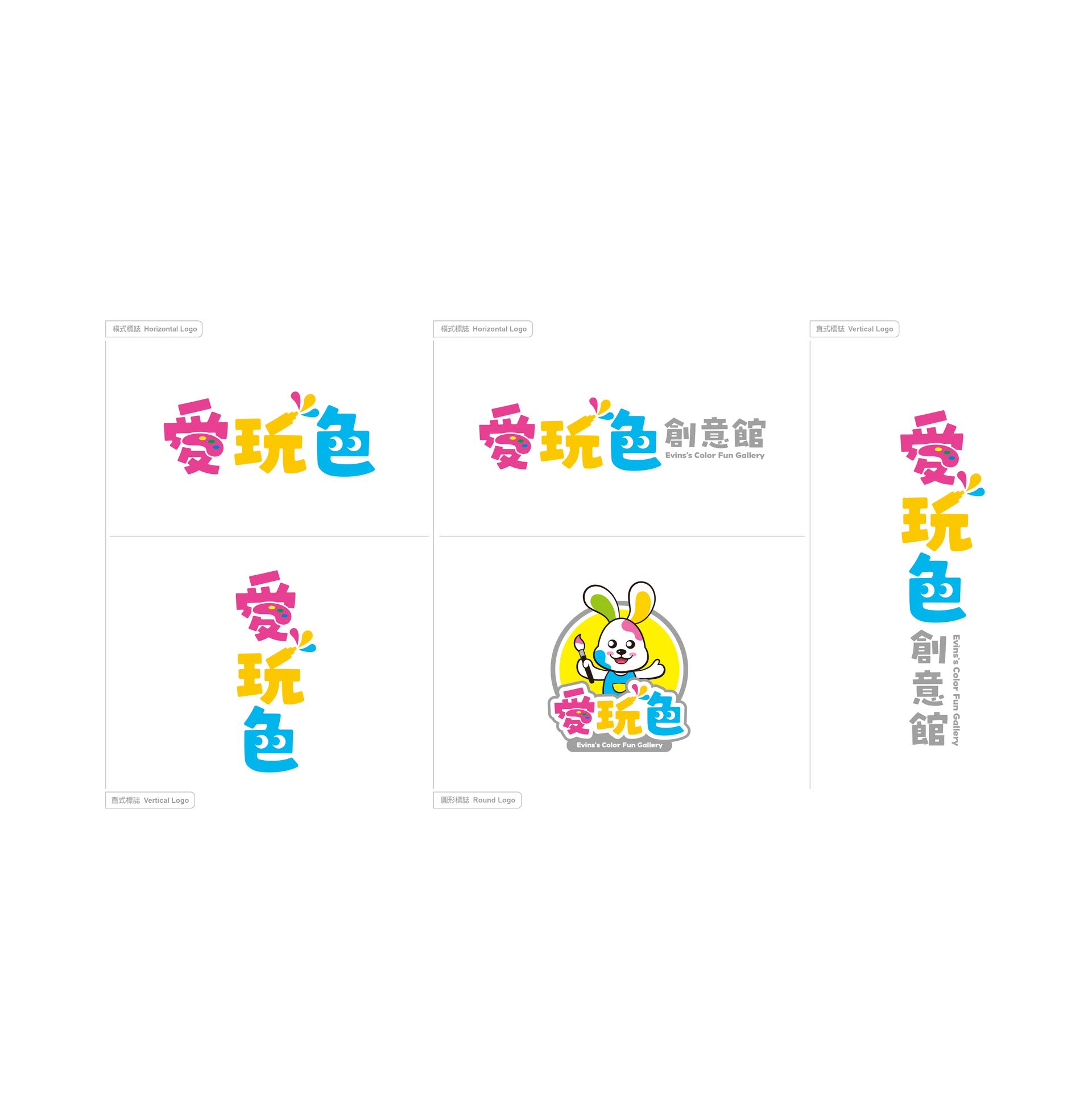
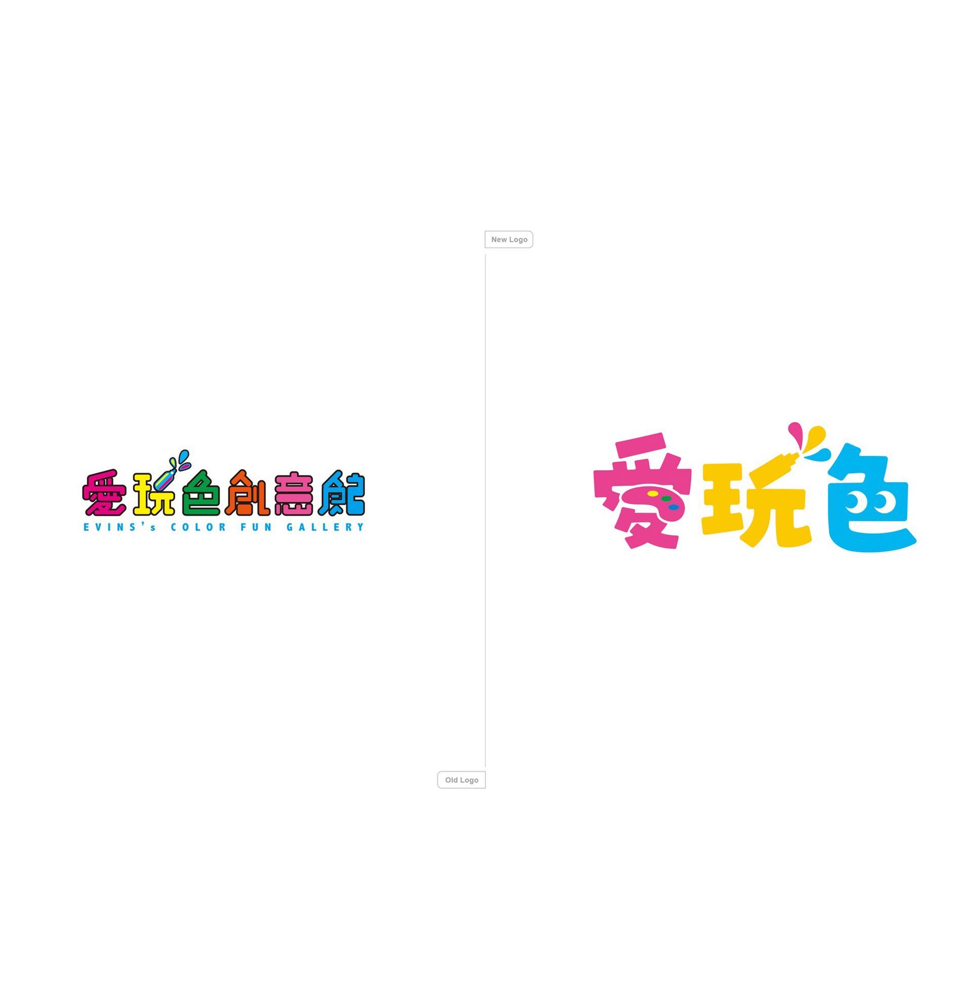
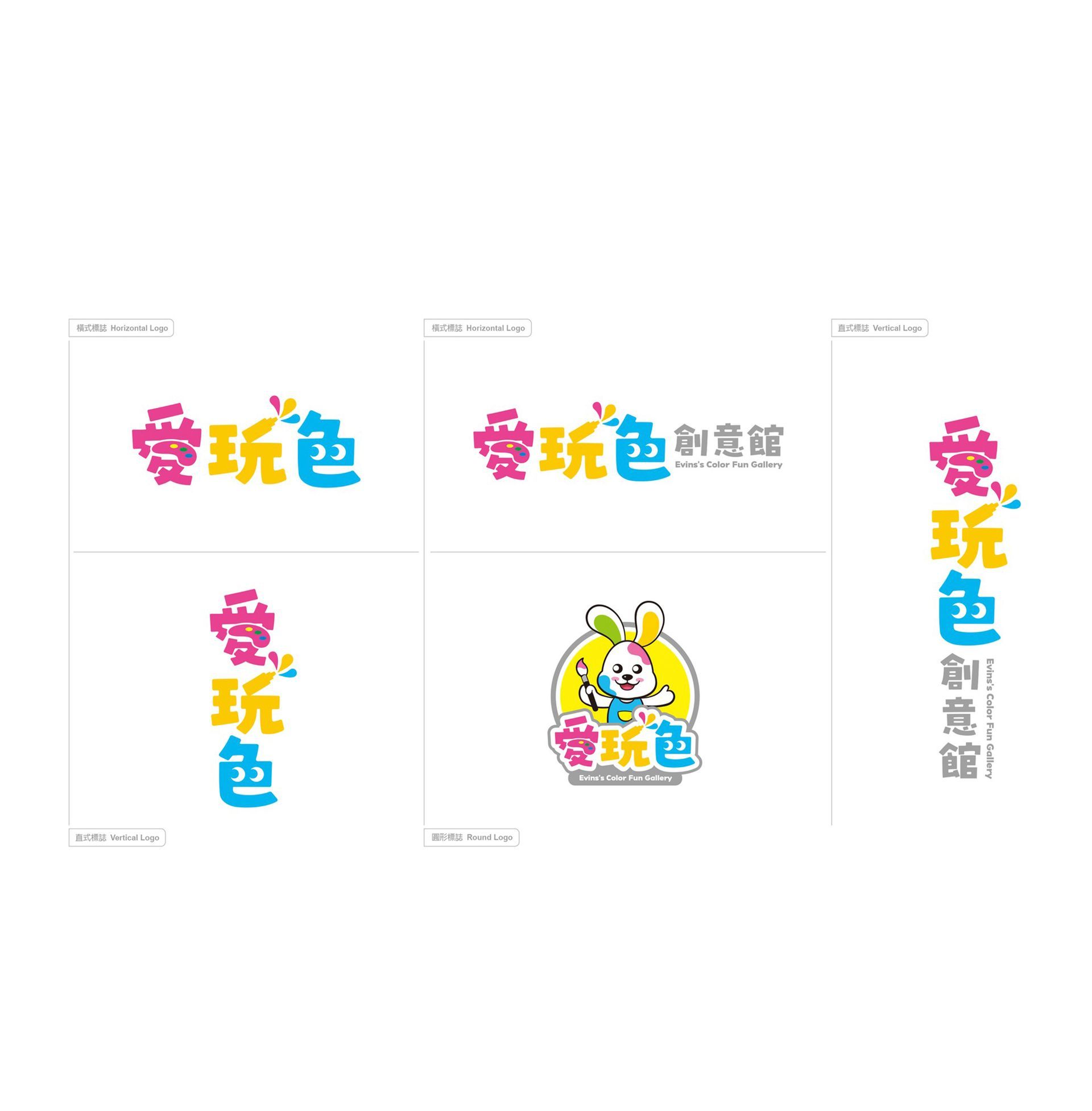
Love (mixing colors), play (with paints), color (exploring colors) – based on the three primary colors of red, yellow, and blue, the brand name cleverly incorporates the imagery of a palette, paint jar, and eye, conveying the creative spirit of painting. The handwritten font style resonates with the audience, creating fun for parent-child interaction, and aspires to expand Taiwanese manufacturing overseas, letting the charm of color reach the world.
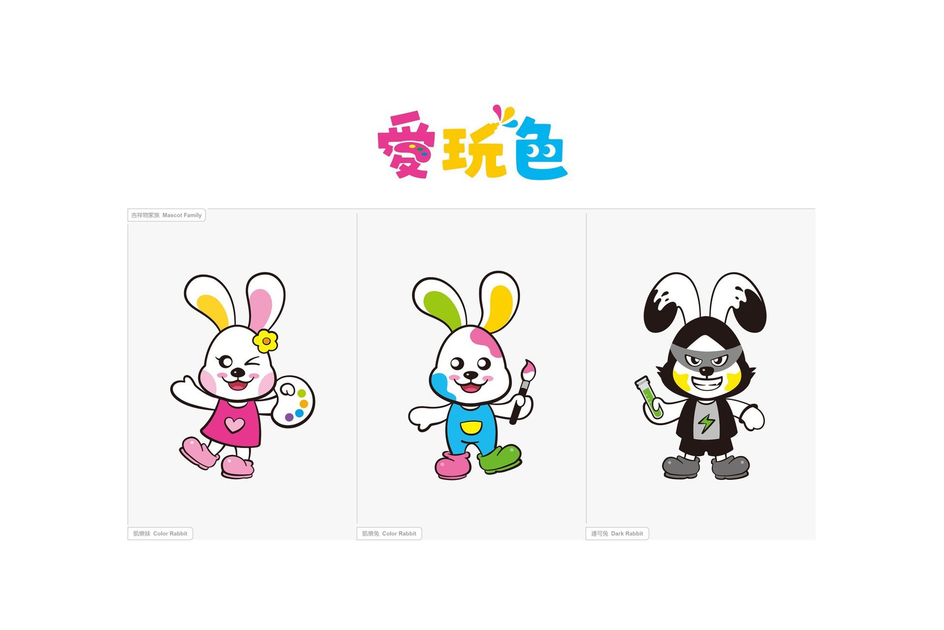
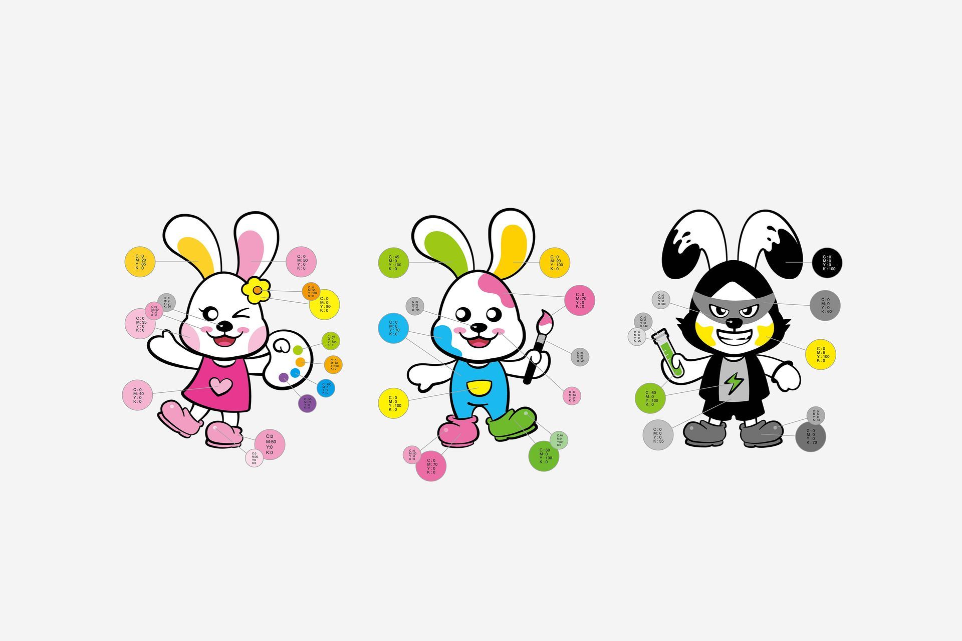
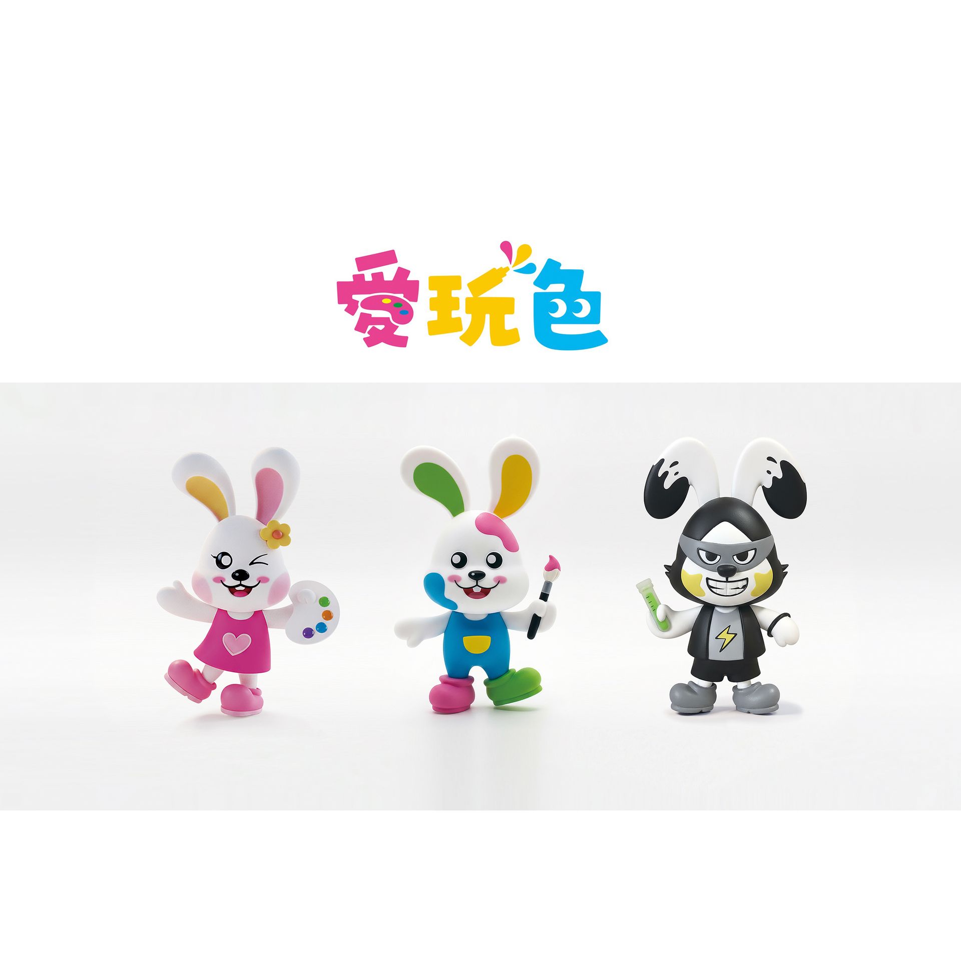
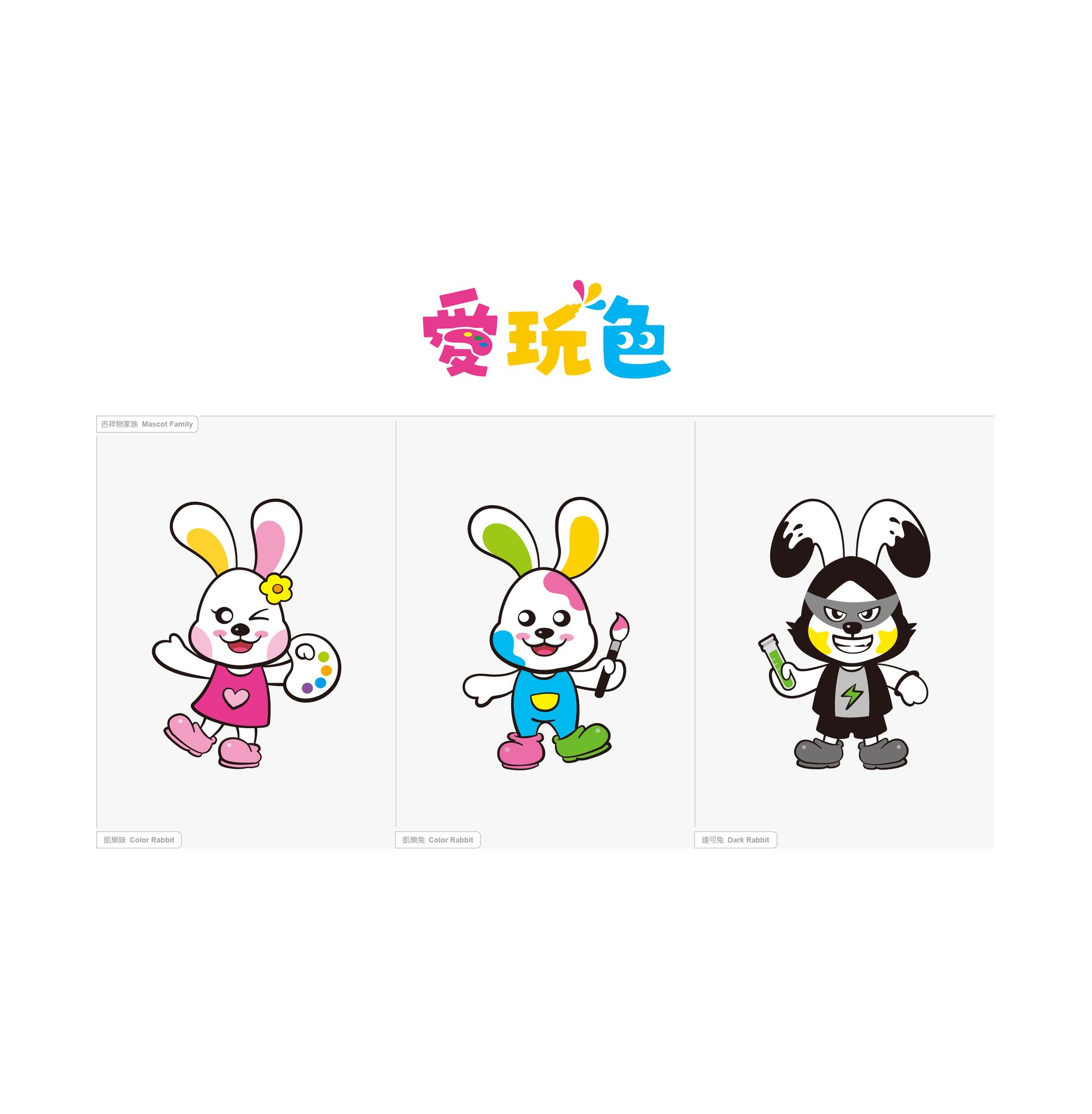
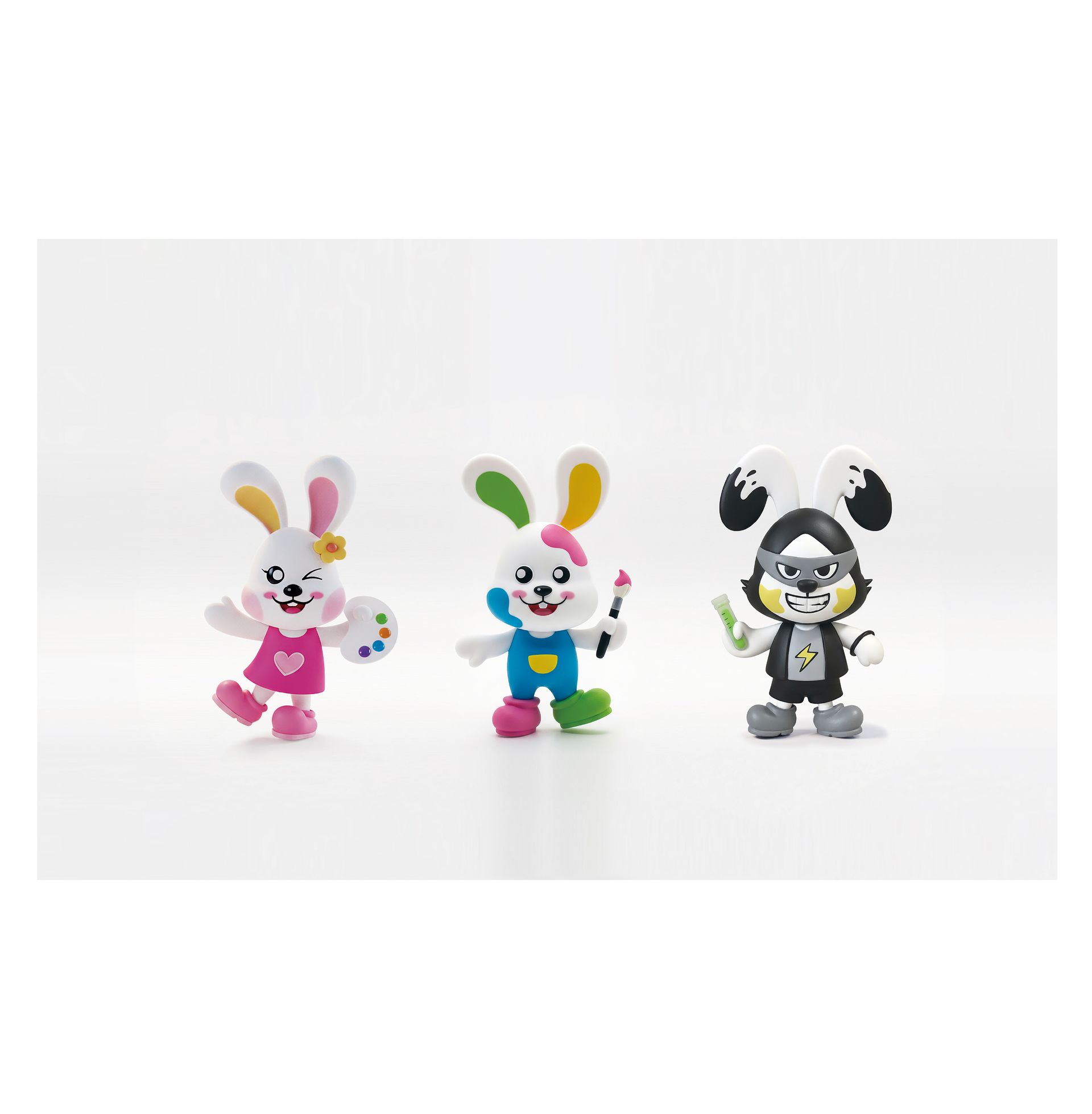
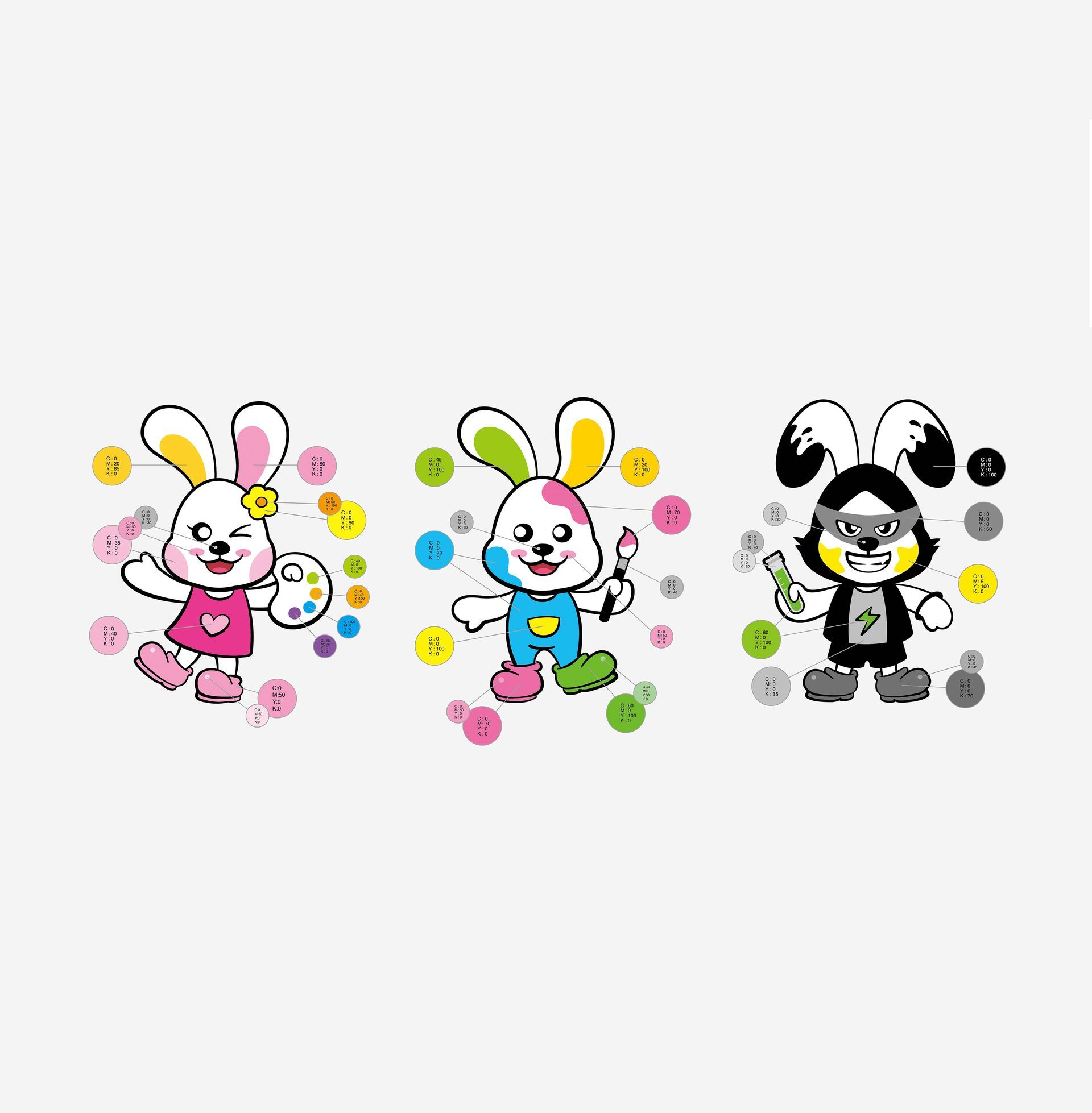
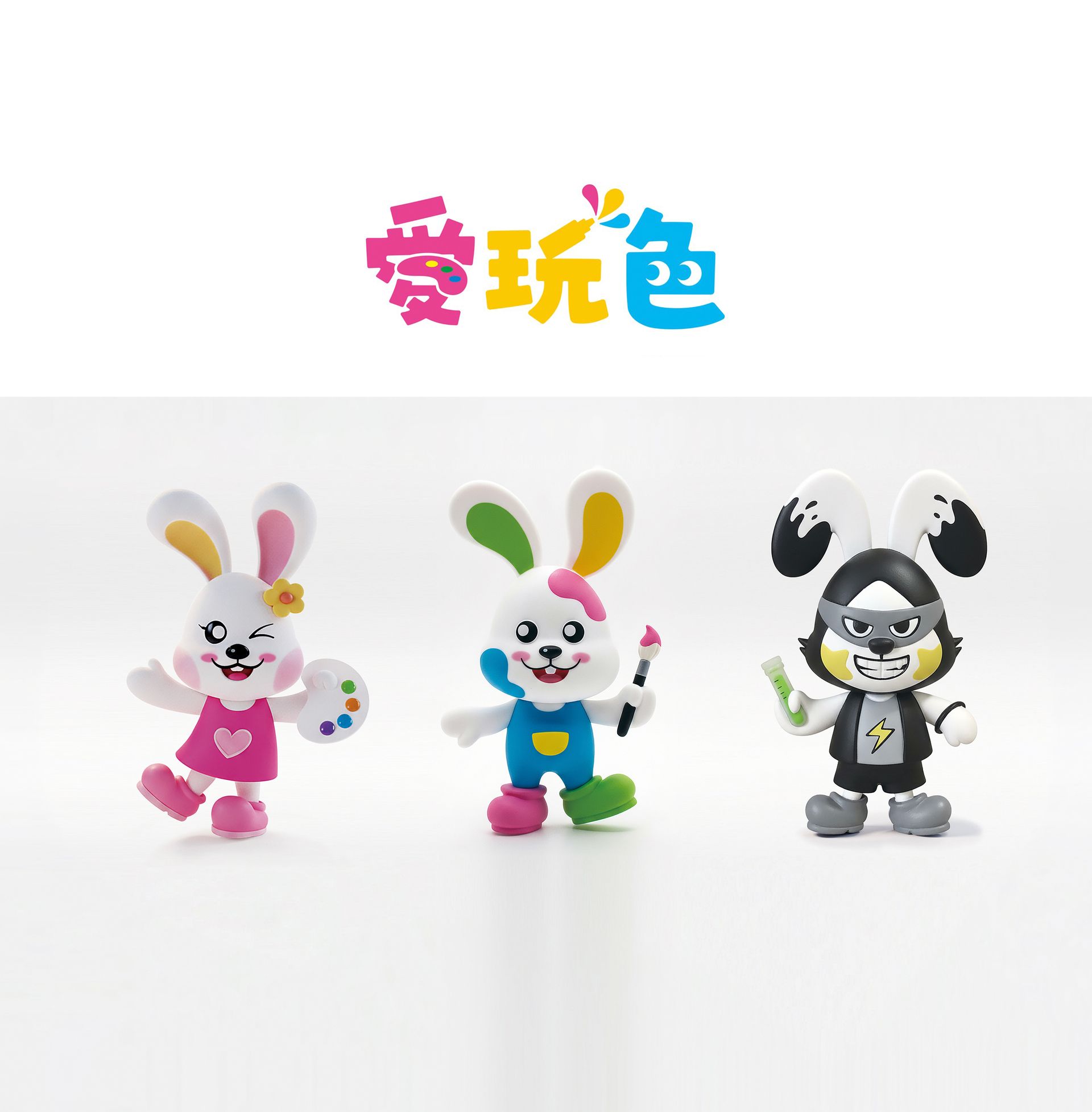
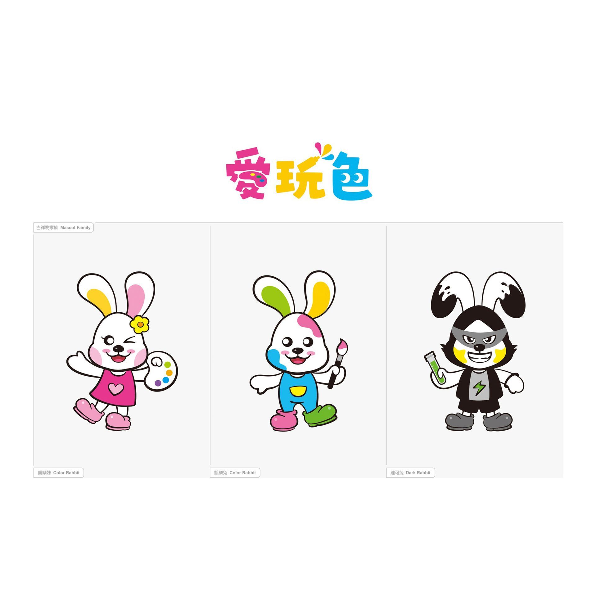
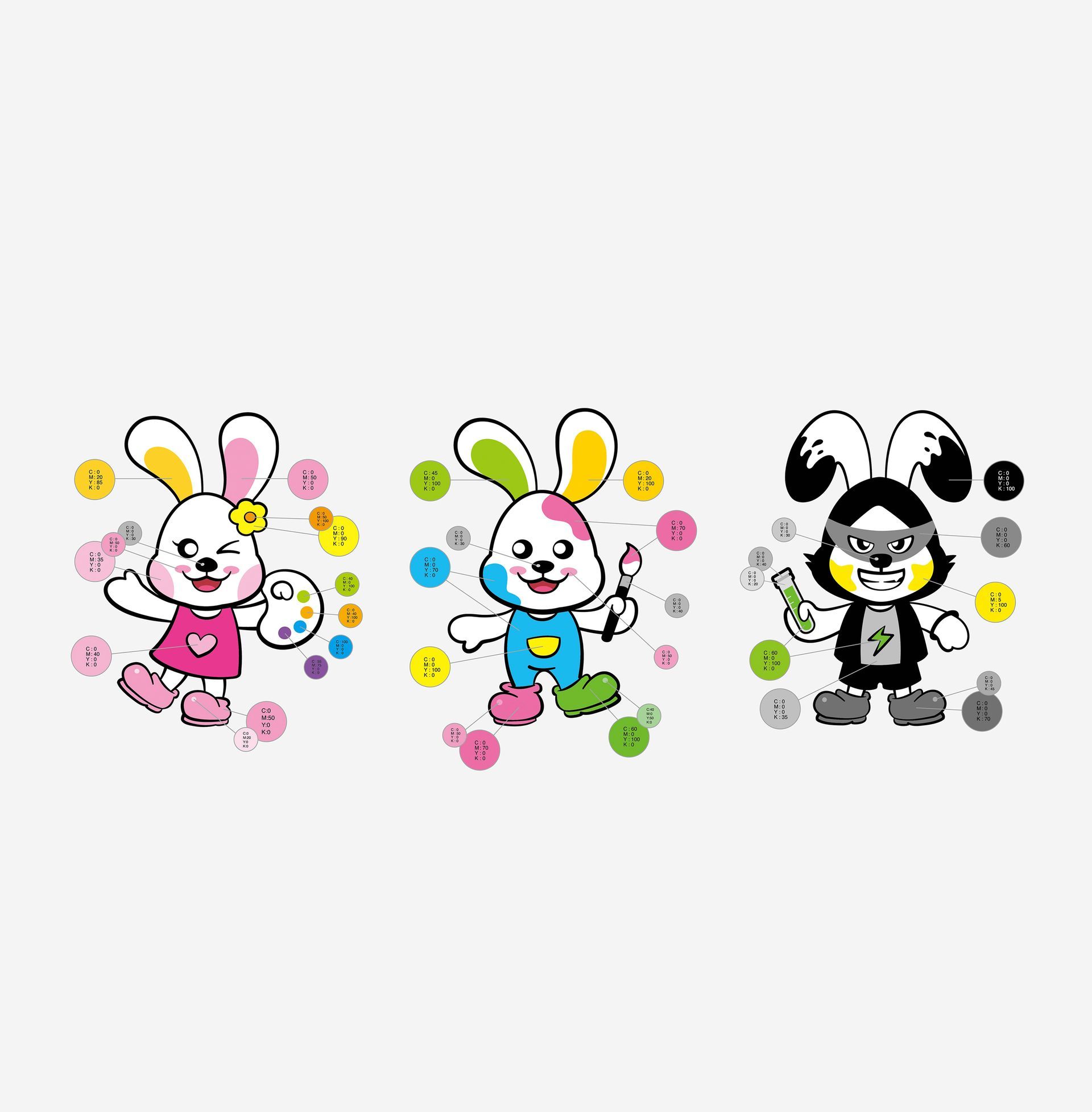
Mascot Concept - The Kailuo Rabbit family was created using the English pronunciations of "color" and "dark," giving each mascot a unique guiding mission to lead children on a diverse and rich journey of color.
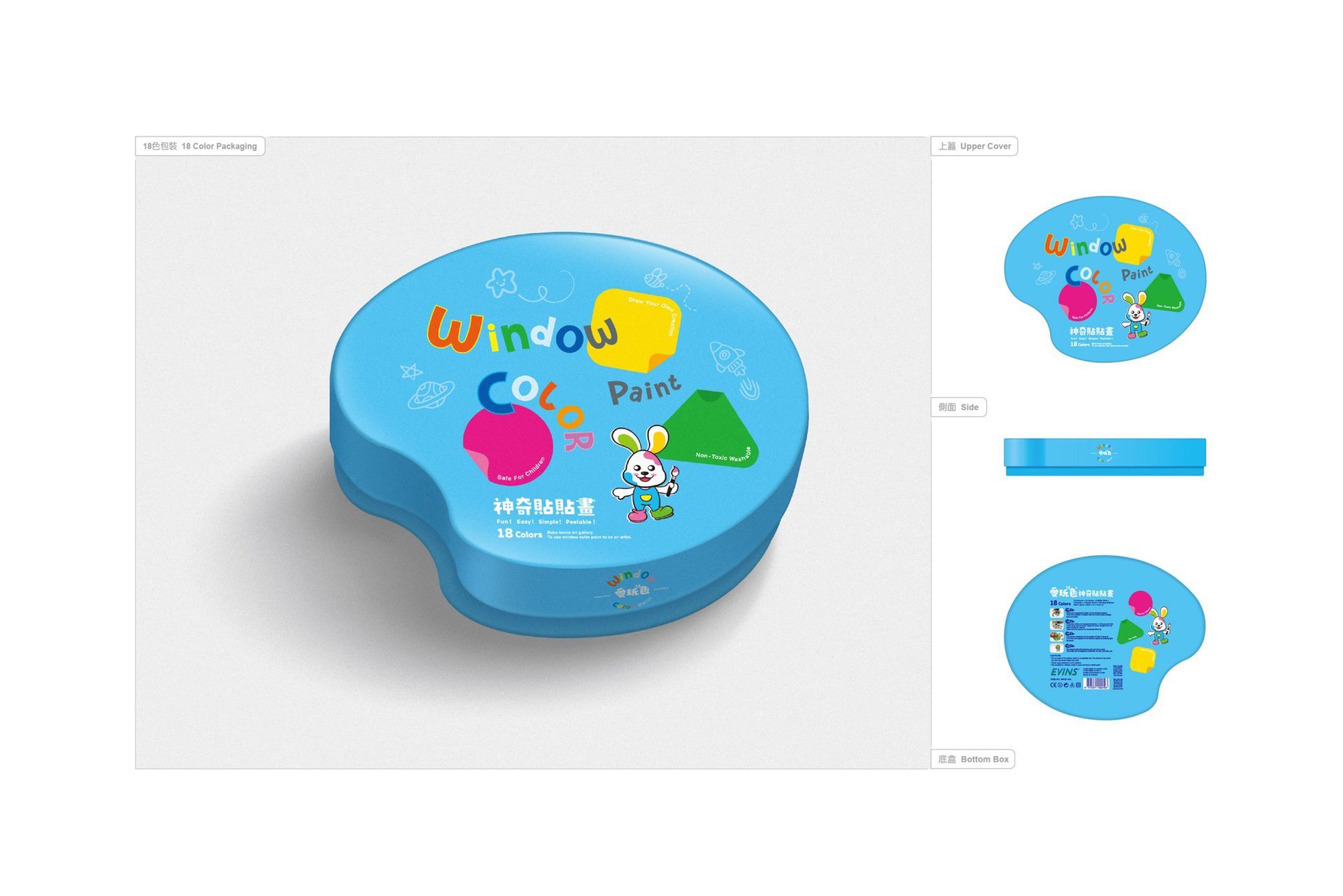
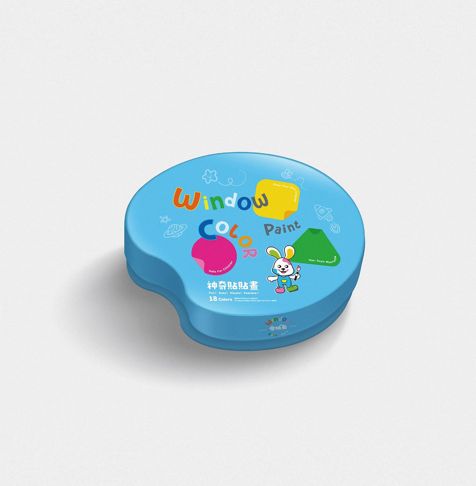
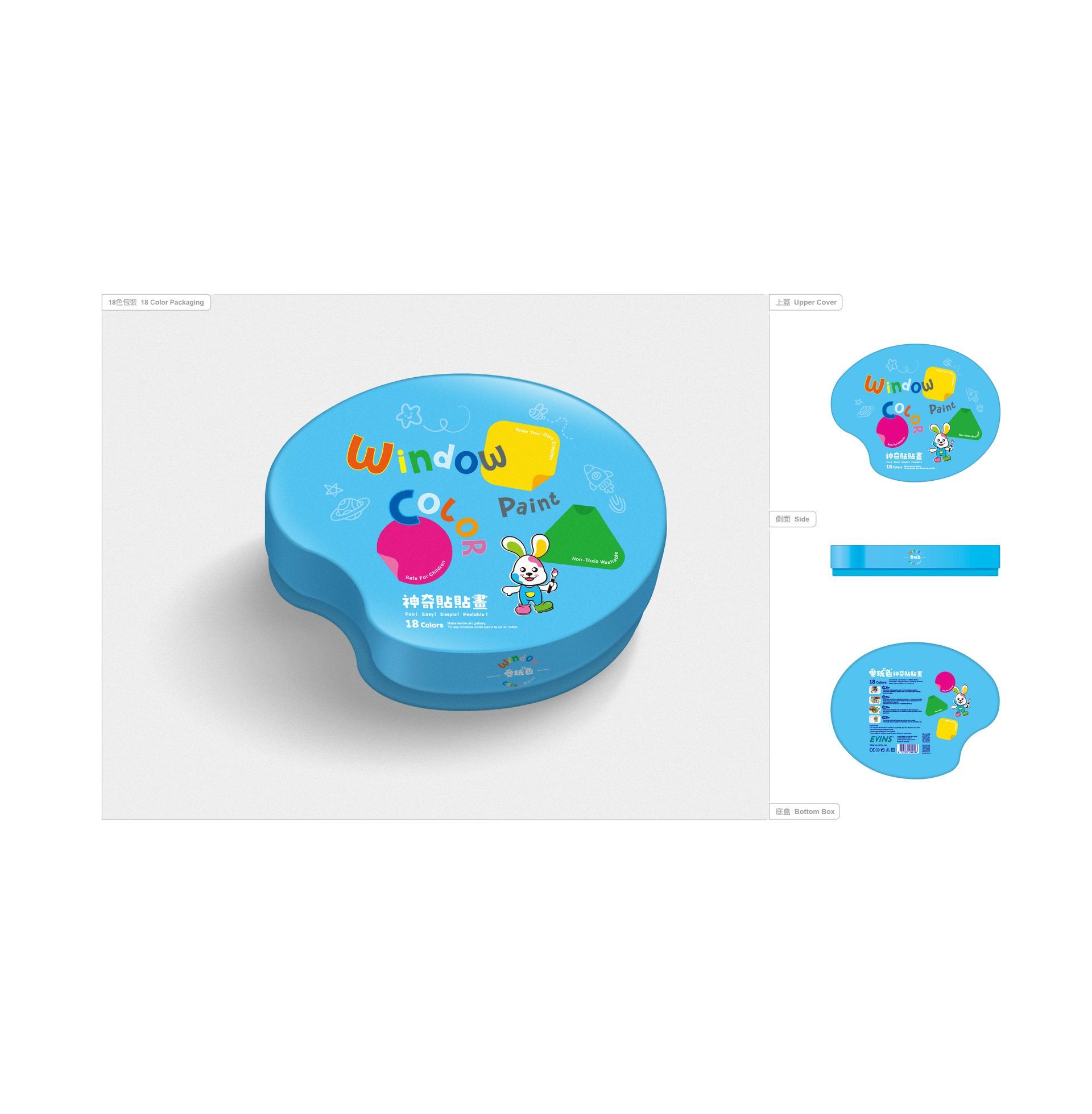
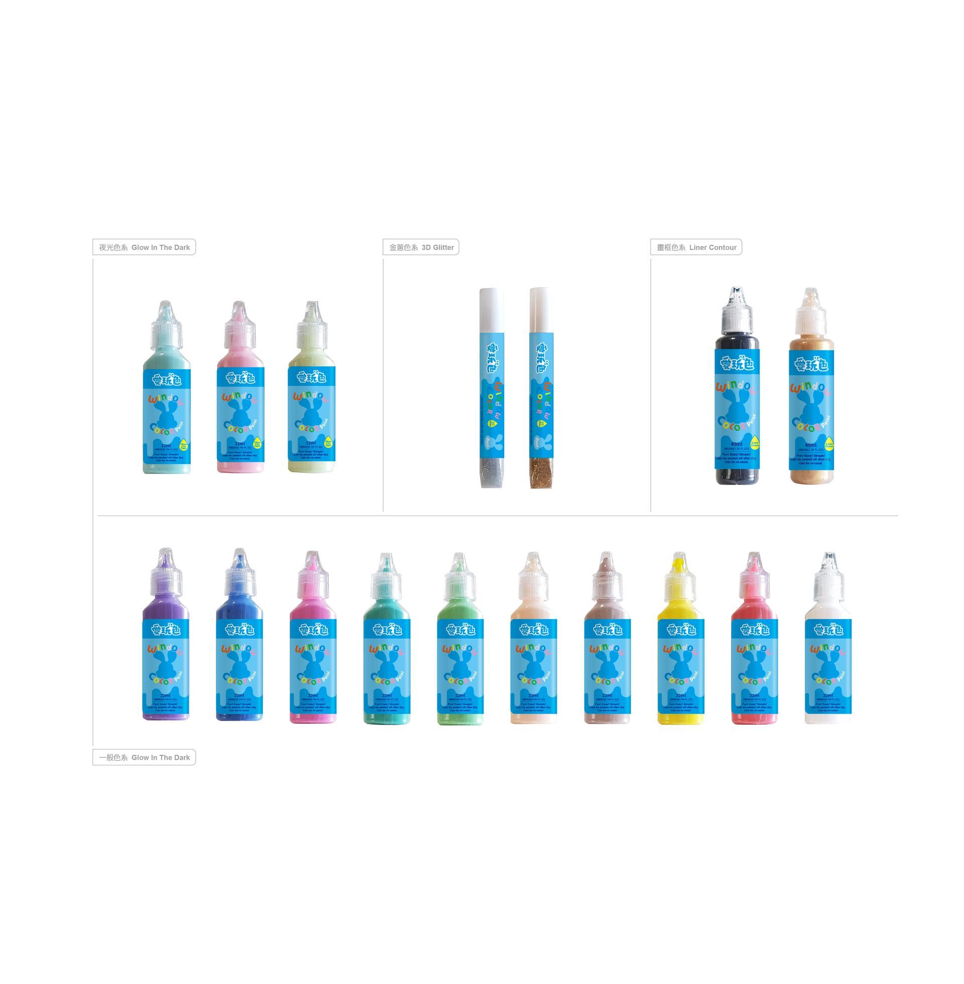
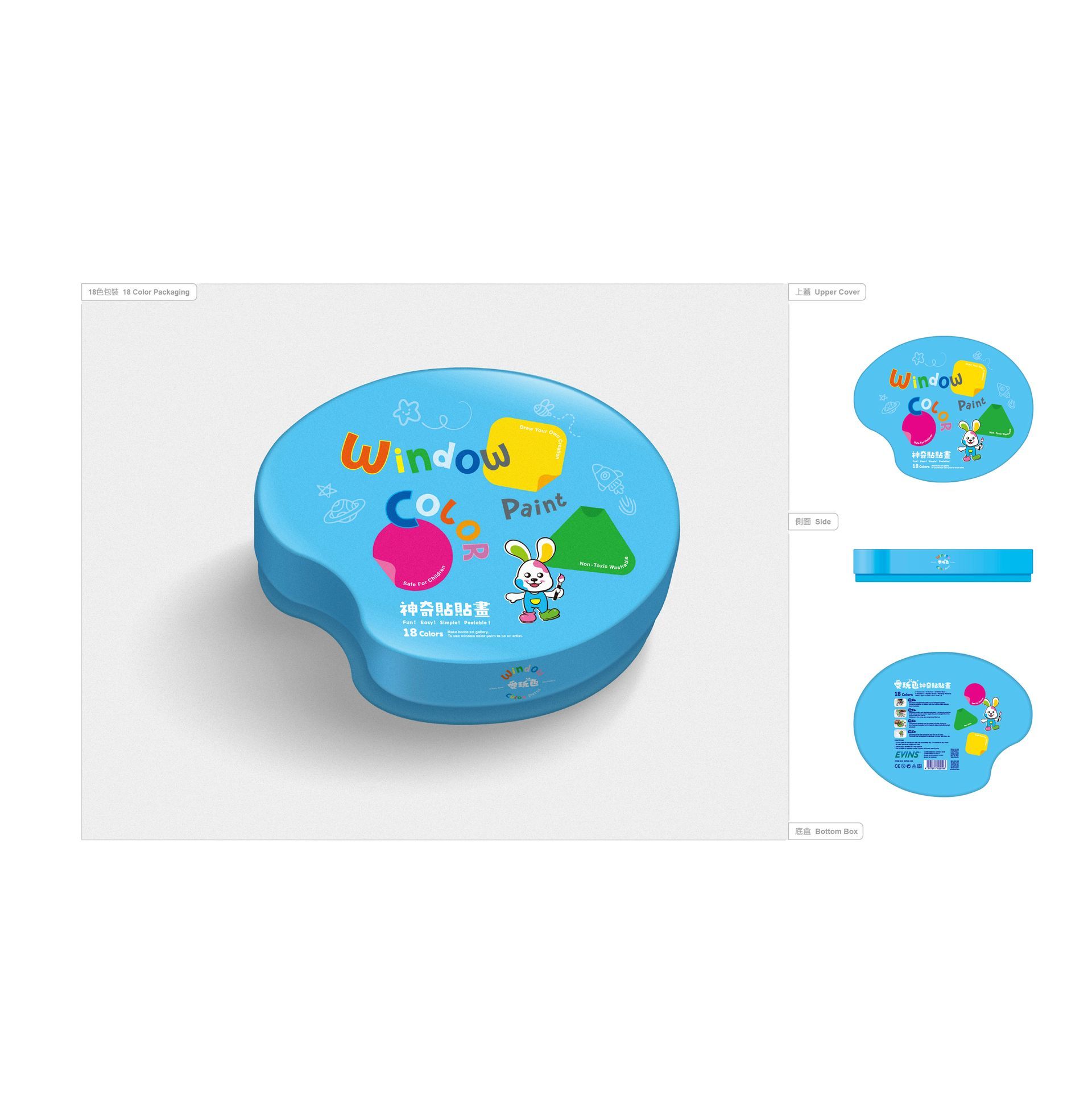
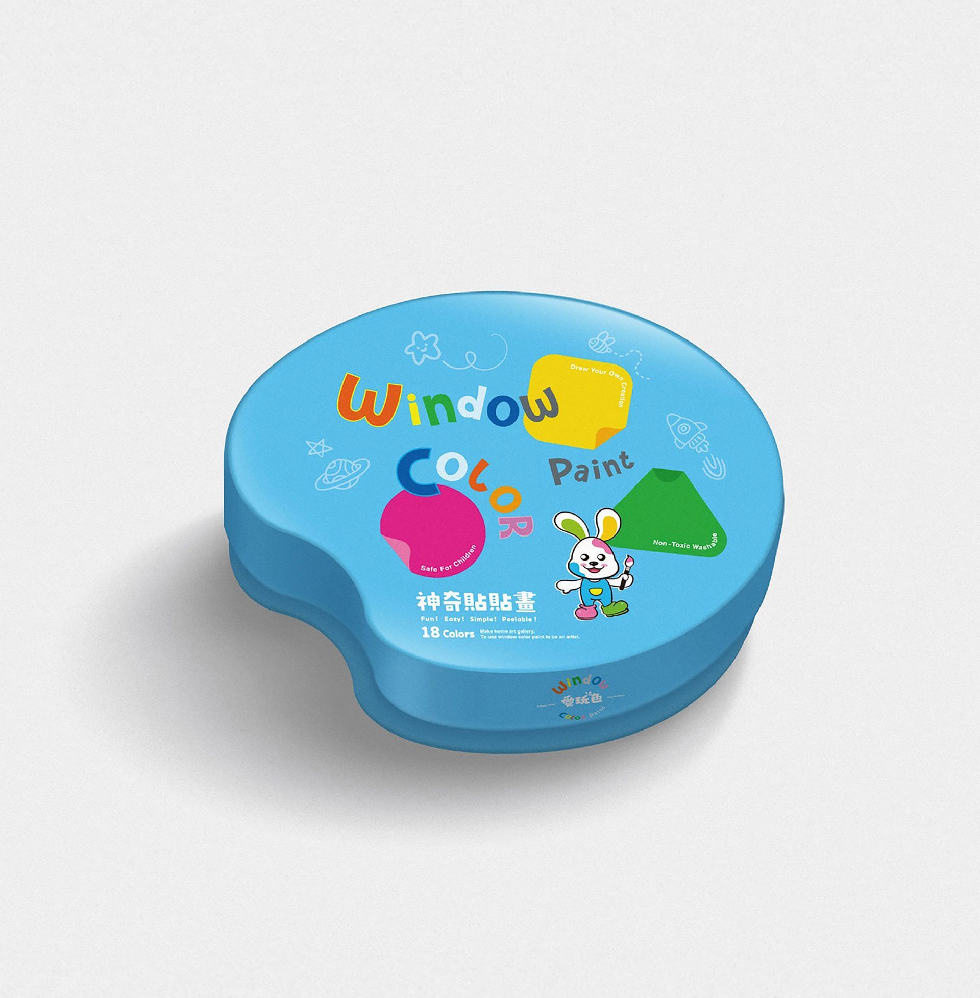
The 18-color packaging concept – the outer box design is inspired by the color palette in the logo, using cute mascots paired with geometric shapes (circles, triangles, and squares) to inspire children's color preferences and train their associative thinking in shapes. It also encourages interactive creation, allowing children to unleash their creativity and paste their own personalized artwork into the geometric shapes on the lid.
- 2025 Changhua County Taiwan Design Exhibition - Shortlisted